Prac03: Arrays and Plotting
Last updated on 2024-10-02 | Edit this page
Overview
Questions
- How do I process large amounts of data?
- What support does Python have for manipulating science and engineering datasets?
- How can I get a quick visualisation (plot) of my data?
Objectives
- Use Python arrays implemented in Numpy
- Use simple plotting techniques using matplotlib
- Apply arrays and plotting to more complex systems dynamics problems
Introduction
In this practical you will be using Numpy arrays to store data. We will then plot data from arrays and lists before using arrays and plotting in some more complex systems dynamics models.
Additional commands in VIM
VIM – additional useful commands
| Command | Description |
|---|---|
| :w | When editing a file, you can save changes so far using
:w from command mode. Press esc to go from
insert to command mode. |
| :w filename | If you want to save a file with a new name from vim command mode,
type :w new_file_name
|
| :q! | To quit without saving changes, use :q! (also good for
backing out if you accidentally put the wrong file name in,
e.g. vim grwth.py) |
| D | To delete the rest of a line (from current cursor position in
command mode), type D
|
| R | To replace the rest of a line (from current cursor position in
command mode), type R, puts you into insert mode |
| u | To undo a command or change, type u, repeat to undo
multiple |
| xG | To go to a line 20 in a file, type 20G. To go to the
last line of a file, type G
|
| A | Appends after the end of the current line, puts into insert mode |
On occasion, you may accidentally hit ctrl-z when using
vim or other programs. This pauses the program, but it is still running
in the “background”. Type fg to bring it back into the
foreground. When this happens, or if you close your machine without
saving the files, a temporary file that vim creates is left behind (when
you save and quit normally, the file is deleted). If you type
ls -la, you can see these “hidden” files – they start with
a “.”, eg. .growth.py.swp. Once you have your file back in
order, you can delete the temp files using
rm .growth.py.swp.
Activity 1 - Plotting Growth
The lectures notes gave modified code for growth.py to
plot the output. Copy growth.py from your
Prac01 directory into your Prac03 directory.
Rename it growthplot.py and update the documentation at the
start of the program. Then make the changes as indicated in the lecture
notes. This includes inserting code for importing matplotlib; creating
and appending to lists; and plotting the data.
Run the program and confirm that it plots your data.
Make the following modifications to your code (do each modification and confirm it works before moving onto the next one):
- Change the colour of the plotted line from blue to red
- Change the symbol for the plotted line to a triangle. Note that the line is formed from many individual data points, these are joined together when we use a line in our plot
- Change the simulation time from 10 hour to 100 hours, now we can see the exponential growth in the population
- Change the plotting back to a line
- Change the plot title to “Prac 3.1: Unconstrained Growth”
- Save the plot to your
Prac03directory
Activity 2 - Reading Numbers with Arrays
In Prac01 we read in ten numbers and printed their
total. Copy num_for.py from Prac01 to
Prac03/numbersarray.py. We will change this file to use
arrays to store the values and then print some summary data.
Make the changes below and run the program:
PYTHON
#
# numbersarray.py: Read ten numbers give sum, min, max & mean
#
import numpy as np

numarray = np.zeros(10)   # create an empty 10 element array

print('Enter ten numbers...')

for i in range(len(numarray)):
    print('Enter a number (', i, ')...')
    numarray[i] = int(input())

print('Total is ', numarray.sum())
Modify the code to:
- Print the min and max numbers entered
- Print the average (mean) of the numbers
- Plot the numbers
Activity 3 - Plotting Growth with Arrays
Copy growthplot.py to growtharray.py. We
will change this file to use arrays to store the values and then plot
the arrays.
- First, update the documentation accordingly.
- To use Numpy arrays, we first need to import the numpy package:
import numpy as np. Add the import line to the start of the program. - Then, create an array of zeros to hold the calculated values
- Modify the loop code to put the values into the array
- Modify the
plt.plotcall to plot the array - If you didn’t provide x-values for time (in hours), add code for x-values
Activity 4 - Plotting Subplots
Copy growtharray.py to growthsubplot.py. We
will change this program to give multiple plots in the same figure.
- Update the documentation accordingly
- Modify the plotting code to do the do the equivalent of the subplot code in the lecture slides (shown below). When adapting the code, the variable names and labels/titles will need to be changed… this is a very common task.
PYTHON
plt.subplot(211)
plt.plot(dates, march2017, '--')  # update the xvalues, yvalues and line style
plt.title('March Temperatures')   # update title
plt.ylabel('Temperature')         # update y label units

plt.subplot(212)                  # as above... for second subplot
plt.plot(dates, march2017, 'ro')  # explore different line styles
plt.ylabel('Temperature')
plt.xlabel('Date')

plt.show()                        # display plot
Save the resulting plot in your Prac03 directory.
Activity 5 - Plotting a Bar Chart
Copy numbersarray.py to numbersbar.py.
Update numbersbar.py to print a bar chart of the numbers.
In the lecture notes, we saw how to plot a bar chart from a list. We
will use similar code to plot the numbers entered into
numbersbar.py
PYTHON
plt.title('Numbers Bar Chart')
plt.xlabel('Index')
plt.ylabel('Number')
plt.bar([0, 1, 2, 3, 4, 5, 6, 7, 8, 9], numarray, 0.9, color='purple')
plt.show()
Add this code to numbersbar.py to print a purple bar
chart. Remember to import matplotlib!
Save it to your Prac03 directory.
Activity 6 - Systems Dynamics Revisited
In growth.py we implemented a simulation of
unconstrained growth. We can use the same approach to simulate decay –
using negative growth. In this example, we can look at a dosage of a
drug, e.g. Aspirin for pain and Dilantin for treating epilepsy.
Download dosage.py and save it into
your Prac03 directory. Run the program and see if you can
understand what it is doing. Look at Chapter 2 of the text for
background. The program dosage4hr.py is
a variation of dosage.py where another two tablets are
taken after 4 hours.
Next download repeatdosage.py and run it. MEC and MTC are values for effective and toxic concentrations, respectively. Note how it takes multiple doses to get up to an effective level. Download skipdosage.py and see the impact of skipped pills on the concentration.
For more background information, this exercise is based on p45-50 Chapter 2 of the Shiflet & Shiflet textbook - http://press.princeton.edu/chapters/s2_10291.pdf .
Activity 7 - Exploring Aspirin Dosages
We have seen the impact of a single dose of Aspirin, and then a
second after 4 hours. Many of these medications can have serious
imnpacts if taken regularly for too long a period. An example would be
to take the dosage4hr.py code and repeat the dosage every 4
hours… make the appropriate changes, which should give a result similar
to the plot below.
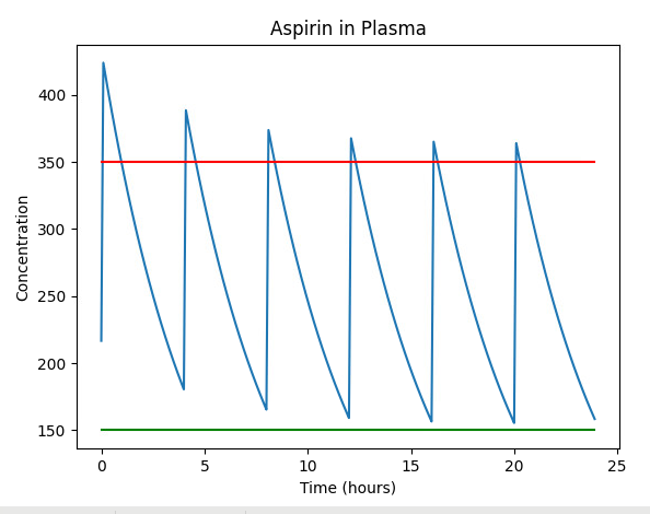
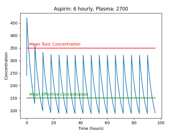
Note that the concentration of Aspirin in the blood plasma is going above the red line, which is dangerous (Mean Toxic Concentration). Also note that the blood plasma volume has/can been reduced to 2700ml, to illustrate the impact of changing these values.
Modifying this code to space the dosages further apart (6 hourly), we see the concentration is now always below the red line.
Also note that you probably have a double-dose at the start - as
shown in the sample plots. This can be corrected by setting the initial
aspirin_in_plasma value to zero (not dose).
Another way to reduce the cumulative impacts of a medication is to not take it in the evening, so there might be 3 6-hourly doses and a gap overnight. This can also be an approach where a medication might keep the patient awake, or not be needed while sleeping. The next plot shows how this might impact the concentration of medication in the blood plasma.

Note that these are all models and we know that models are WRONG. There are many assumptions to consider. Blood plasma Would vary between people, and could be approximated, perhaps by weight. Drug absorption levels would vary by person, and by the contents of the stomach, or could be bypassed if the drug is given intravenously. Similarly, excretion of the drug might vary by person, and depend on their overall health.
It is a simpistic model, however, it is incredibly useful in conveying how repat doses of drug accumulate and compund.
Activity 8 - Scaffolded Challenge: Rainbows
Given we can draw a line plot in various colours, how might we plot a rainbow?
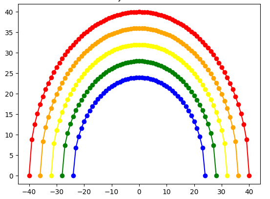
So, where might we start?
Challenge
Consider how you might generate a curve. Perhaps an upside-down parabola?
PYTHON
import matplotlib.pyplot as plt
import math

# Basic Curve
r = 5
for i in range(-r,r+1):
    plt.plot(i, r**2 - i**2,"bo")
plt.title("Basic Curve")
plt.show()
This code gives one curve of blue circles, but the shape is wrong.
A circle gives a more realistic curve… so we can use the
x**2 + y**2 = r**2 formula to find points on the edge of a
circle.
We can use the loop index to map to a particular colour, and also to change the radius of the circle.
PYTHON
import matplotlib.pyplot as plt
import math

# Many Curves 10,9,8,7,6
for r in range(10,5,-1):
    for i in range(-r,r+1):
        if r == 10:
            colour = "red"
        elif r == 9:
            colour = "orange"
        elif r == 8:
            colour = "yellow"
        elif r == 7:
            colour = "green"
        else:
            colour = "purple"
        plt.plot(i,math.sqrt(r**2 - i**2),color=colour, marker="*")
plt.title("Many Curves")
plt.show()PYTHON
# Many Curves - arrays
import numpy as np
res = 4
for r in range(10,3,-1):
    size = r * res * 2 + 1
    xarray = np.zeros(size)
    arcarray = np.zeros(size)
    if r == 10:
        colour = "red"
    elif r == 9:
        colour = "orange"
    elif r == 8:
        colour = "yellow"
    elif r == 7:
        colour = "green"
    elif r == 6:
        colour = "blue"
    elif r == 5:
        colour = "indigo"
    else:
        colour = "violet"
    for i in range(-res * r, res * r + 1):
        xarray[i] = i
        print(r, i)
        arcarray[i] = math.sqrt((res * r)**2 - i**2)
    plt.plot(xarray, arcarray, color=colour, marker="o")
plt.title("Many Curves - arrays")
plt.show()
Submission
Update the README file to include:
- growthplot.py
- numbersarray.py
- growtharray.py
- growthsubplot.py
- numbersbar.py
- dosage.py
- repeatdosage.py
- rainbows.py
along with any additional programs and charts you have created.
All of your work for this week’s practical should be submitted via Blackboard using the Practical 03 link. This should be done as a single “zipped” file. Submit the resulting file through Blackboard. (refer to Practical 00 or 01 for instructions on zipping files.
There are no direct marks for these submissions, but they may be taken into account when finalising your mark for the unit. Go to the Assessment link on Blackboard and click on Practical 03 for the submission page.
And that’s the end of Practical 03!
Key Points
- Arrays give compact storage and additional functionality when working with collections of data of the same type.
- Arrays are implemented in the
numpypackage, which youimportto be able to use them. - Plotting data aids understanding and helps us see trends.
- We can plot using
matplotlib. Other packages will be explored later in the semester
Reflection
- Knowledge: What are the names of the two Python packages we use for arrays and for plotting?
- Comprehension: What changes if we replace plt.xlabel(‘Count’) with plt.xlabel(‘Time’)
- Application: What value would you give to plt.subplot(???) to set up the 2nd plot in a 2x2 set of subplots?
- Analysis: What type of file is created when we save a plot?
- Synthesis: Each week we create a README file for the Prac. How is this file useful?
- Evaluation: Compare the use of lists and arrays in the growth*.py programs. Name two advantages of using lists, and two advantages of using arrays
Challenge
For those who want to explore a bit more of the topics covered in this practical. Note that the challenges are not assessed but may form part of the prac tests or exam.
- Modify
growthsubplot.pyto print four subplots (2x2) – the additional plots should print green squares and black triangles. (hint: subplot 1 is subplot(221)) - Modify
growthsubplot.pyto print nine subplots (3x3) – the additional plots should print green squares, black triangles, black circles, black squares, blue triangles, blue circles and blue squares. (hint: subplot 1 is subplot(331)) - Extend the aspirin simulation length in dosage4hr.py to see what happens over time with repeated dosages
- Modify dosage4hr.py to see the impact of having doses every 2 hours